The Other Side of the Tracks
by Jacob Moore
Just north of Chelsea’s galleries is the largest private real estate development in US history. Who is Hudson Yards for — and is anyone paying attention?
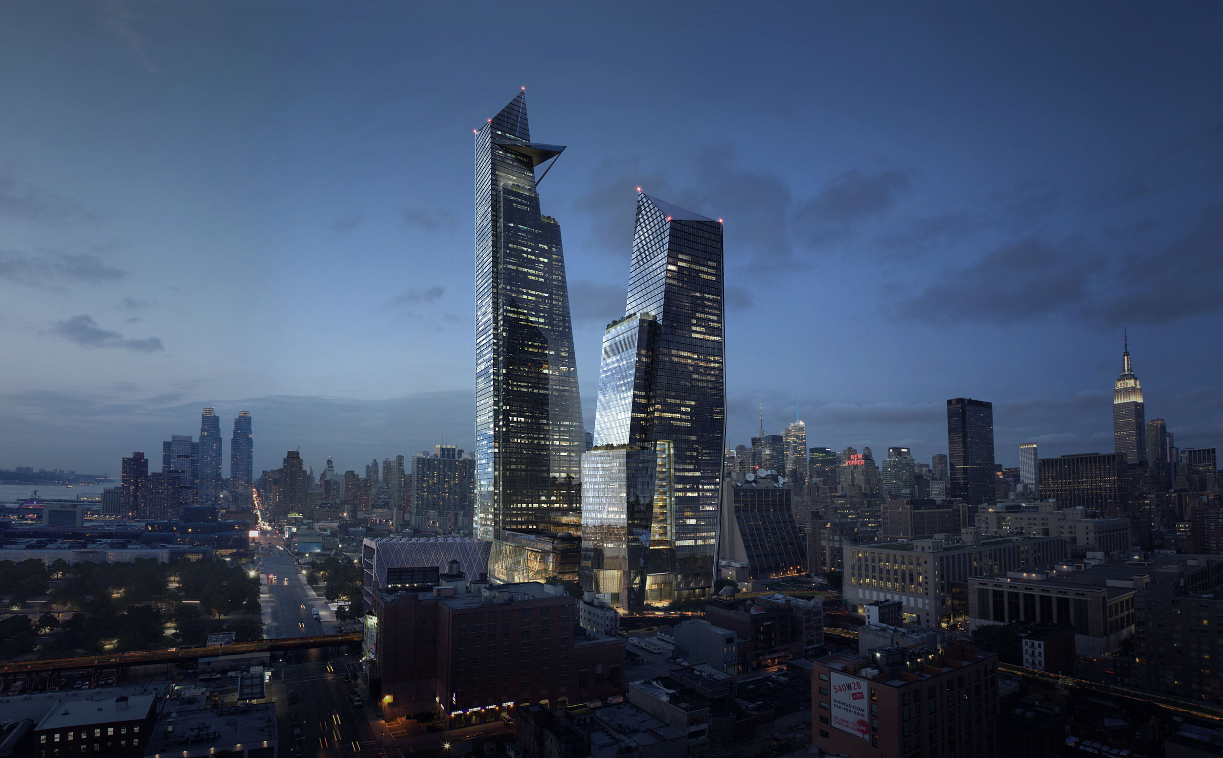
A view of 10 and 30 Hudson Yards, looking north from Chelsea. Courtesy the Related Companies.
I.
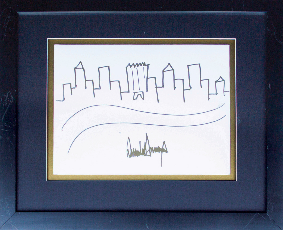
Real estate is booming again in New York, even more than in 2005, when Donald Trump scrawled the city’s skyline as a gold-matted auction lot for — of all things — a literacy charity. The New York that Trump sketched out was a cookie-cutter collection of anonymous towers, and only one was given any prominence: his namesake Trump Tower, dating to 1983, which he rendered with a jagged apex less reminiscent of Der Scutt’s architecture than Bart Simpson’s coiffure. Now the building could convincingly sit at the center of any number of caricatures, but a decade ago a Trump Tower joke would have barely been worth the ink. A sketch of the skyline from those days would have seen Renzo Piano’s New York Times headquarters, or David Childs’s Time Warner Center, taking center stage. Or, more likely, with Childs’s new downtown landmark at 1 World Trade Center yet to top out and the supertall towers on 57th Street’s “Billionaire’s Row” years away from their own cresting, classics like Lamb’s Empire State or Van Alen’s Chrysler might have made an appearance. But then and now, these iconic towers are only able to stand out against a background that’s drawn in — by developers, architects, or citizens — as neutral.
It is anything but. The field of American architecture has had to check its ego since the crash of 2007–08, which after all originated in the houses and condominiums that developers overbuilt and financiers overleveraged. One result is that signature towers, along with their signature designers, are fewer and farther between. Certain important exceptions notwithstanding, “starchitecture” is increasingly in the rearview mirror as a disciplinary paradigm, at least here in the United States, and thankfully so. Many prominent voices of the last few decades — Frank Gehry, Rem Koolhaas, Robert A.M. Stern — are inching toward retirement, restructuring their firms as more collaborative enterprises of design and legacy management. And though time will tell how today’s younger firms come into professional maturity, big personalities and correspondingly flashy buildings aren’t nearly as cool, or marketable, as they once were. For every Bjarke Ingels, the 42-year-old signing the west side courtyard/tower hybrid known as Via 57 West, there are now a dozen firms like A+I, Taller KEN, and SO-IL (you know their tent for Frieze New York), who from their acronymic names onward cultivate a certain self-effacement.
Yet the bulk of the city, the part that the developer-turned-president barely bothered to sketch in that ghastly charity scribble, has never relied on name-brand architects anyway. It has always been built by firms whose approach transcends the individual in favor of the corporate. And demand for this expertise is only scaling up.
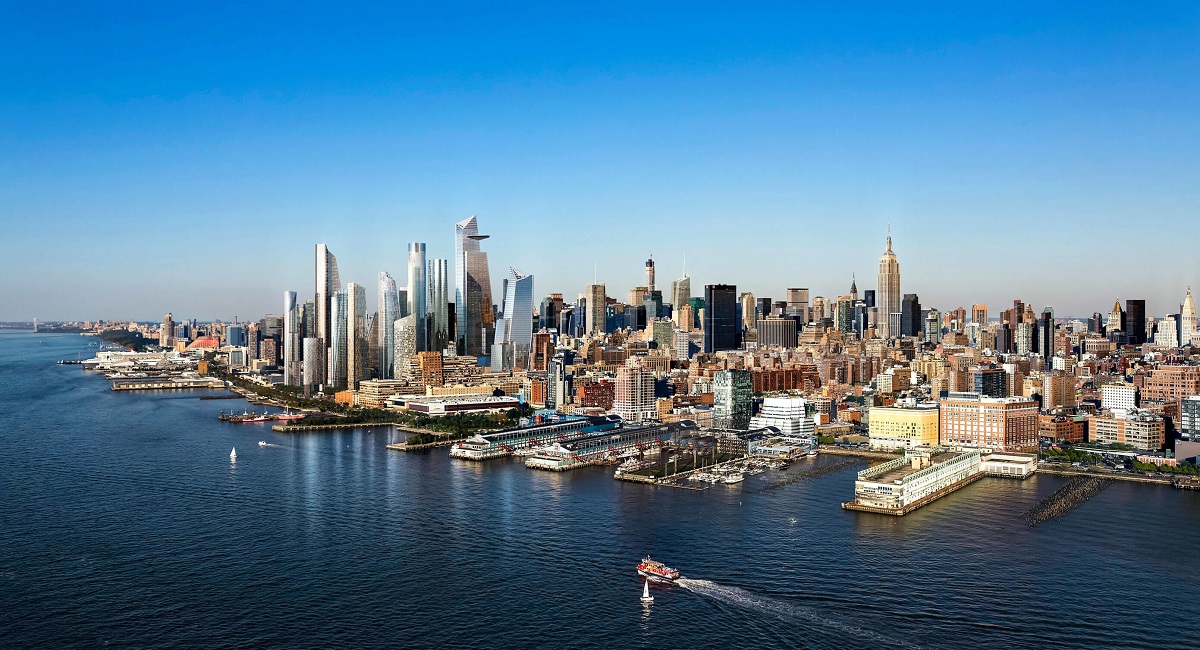
Even the most casual observer of New York real estate today will have noticed that megaprojects are on the rise. From the Lower East Side’s Essex Crossing to the BAM Cultural District in downtown Brooklyn to the Hudson Yards on Manhattan’s western edge, working, shopping, and sleeping seem to be getting closer and closer for New Yorkers of means. Soon to be gone, we are told, are the days of cross-city commutes, overcrowded Midtown streets, and desolate nights in the Financial District. The future, it seems, is mixed-use. And although there’s nothing new about this idea on its own — imagine the pharmacy downstairs and apartment upstairs on any “Main Street, USA” — what is new is the scale and rate at which it’s happening, here in New York and around the globe. Urban renewal has been renewed, and this time there’s a mall attached. With their purported formal, social, and economic impact on the city, projects such as Hudson Yards would seem to demand every New Yorker’s attention. And yet even in the art world, whose Chelsea epicenter is right next door to the construction site, the project has been rising with little attention. It shouldn’t be this easy — should it? — to be bored by the largest private real estate development in the history of the United States.
II.
It may be appropriate, in that underwhelming superlative light, that the Hudson Yards we are getting to know today — a stretch of Manhattan running from 30th to 34th Streets and from 10th to 12th Avenues, mostly occupied by a rail yard — began with a failed Olympic bid. In 2005 the architecture firm Kohn Pedersen Fox (KPF) was hired to design a new stadium, intended to host the opening ceremonies of the summer Games and, thereafter, to host the Jets football team as well as an expanded Javits Center, and to catalyze the long-imagined, always evasive redevelopment of Midtown’s far west side. When the Olympics went to London instead, Mayor Michael Bloomberg’s gaze remained focused on Manhattan’s “one last frontier,” and the neighborhood was rezoned for a mix of high-end residential, commercial, and retail space, with public transit and parkland to boot. The financial crash complicated matters, and the New York state legislature in Albany blocked the stadium, but the city did succeed in extending the subway’s 7 line south from Times Square. The Related Companies, with billionaire developer Stephen Ross at its helm and KPF alongside, then forged ahead with the ambitious covering of the railway tracks. Seeking to build on the lessons of its Time Warner Center, Related’s previous mixed-use monolith at Columbus Circle, the developers bought additional property at the development’s edges. (Its major mistake at Columbus Circle: letting others profit off its work.) The city, too, would rely on the multiplication of these property value increases, in order to offset — via tax revenue — the more than $350 million in subsidy that would ultimately be required to get the neighborhood off the ground.
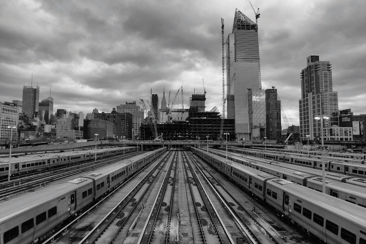
Beyond its exorbitant finances, the claim that Hudson Yards is a new neighborhood unto itself is not hyperbole. At 28 acres, it is roughly comparable in scale to the nearby Flatiron or Meatpacking districts, each of which retains (and markets) its own distinctive characteristics. And Related has made a major push to remind New Yorkers that a full 50% of the development will be dedicated to “gardens, plazas, playgrounds, and [a] public square.” You can already get a view of the coming neighborhood from the High Line, which at 8 million annual visitors is now more popular than the Statue of Liberty, and whose recently opened extension wraps around Hudson Yards’s west flank. From the start, the team behind this private megadevelopment has been pushing a line of public engagement. Childs, whose firm Skidmore, Owings & Merrill is designing one of the towers, told New York magazine that “we want this project to be laced through with public streets, so that everyone has ownership of it, whether you’re arriving in your $100,000 limo or pushing a shopping cart full of your belongings.”
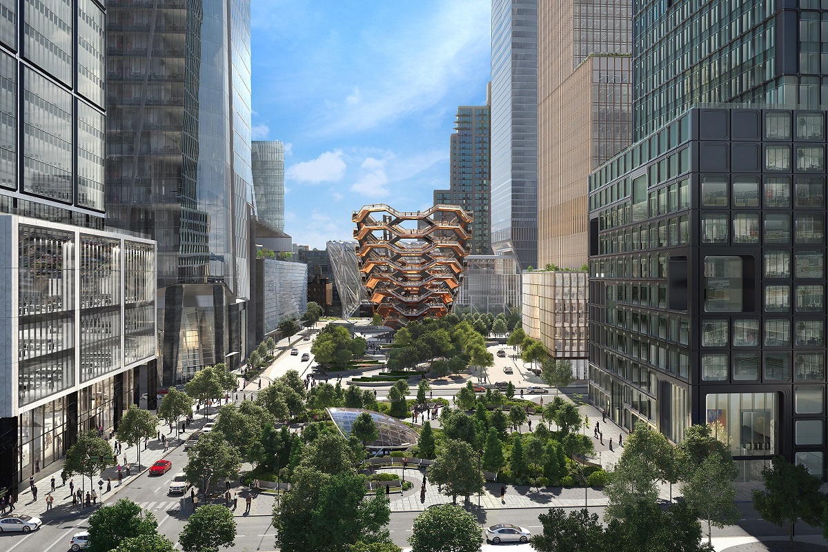
Hudson Yards will include 18 million square feet of commercial and residential space, one million square feet of retail, and an extensive set of interconnected parks and plazas, all lying above railway tracks and posing immense engineering challenges. To put it mildly, it is not a job for beginners. Together with Related, Kohn Pedersen Fox has been the driving force behind the Yards’s design, even as the project has grown to include a whole consortium of architects, engineers, consultants, technology teams, and development professionals. (Others include Diller Scofidio + Renfro, who are designing a luxury residential tower as well as the Shed art center, and Thomas Heatherwick, responsible for the staircase to nowhere known as the Vessel.) Established among the largest of internationally prominent, corporate architecture offices, KPF has sought since its founding “to make buildings that married art and commerce,” according to its president, James von Klemperer. Not surprisingly, the commerce side of that equation seems to win out in terms of the company’s public image. Accordingly, in the spirit of the filler buildings in the now-presidential sketch, they’re more likely to be covered in journals of professional practice than in art magazines. That’s a shame, considering the formidable impact and reach of their work.
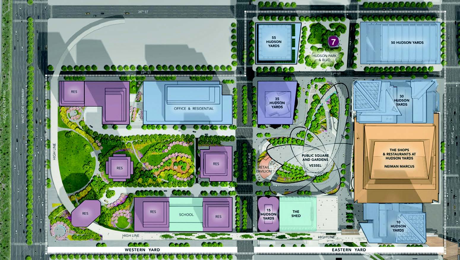
From Chicago to Shanghai, from Toronto to Seoul, the mixed-use tower complex at KPF seems to function more as an ideology than a simple typology. You know their buildings even though you don’t know their names, if you spend much time in the rich world’s epicenters and sleep in its Park Hyatts and Ritz-Carltons. Roppongi Hills in central Tokyo, the International Commerce Centre in Kowloon, the One Nine Elms project rising in the south of London: these are all KPF productions, and Hudson Yards may indeed be the culmination of 40 years of, in their own words, “seamlessly blending infrastructure with architectural designs.” That blend has been initially and most prominently articulated at 10 Hudson Yards and 30 Hudson Yards, the first two towers designed by KPF to rise on the site. They stand along 10th Avenue, anchoring the megaproject’s eastern edge, and obey the admirable mandate from Related to have a marked presence on the skyline, prompting visitors to look up. The architects — with William Pedersen as the partner in charge and director Marianne Kwok leading the design (together with a mostly female team, an unfortunately rare occurrence in the field) — responded by making the two towers “dance” with each other, swirling the formerly disjointed city to the east and river to the west together in their embrace. Accordingly, the leaning buildings are held in simulated tension, topping out with differently angled, diagrid peaks that further insinuate circular motion. An outdoor observation deck at 30 Hudson Yards — soon the highest in the city — lends a welcome imbalance to the dancers’ attenuated embrace.
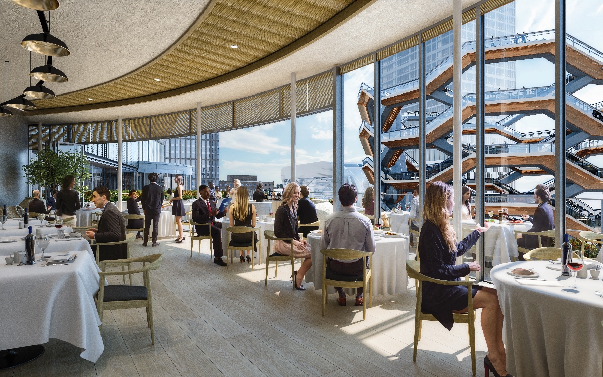
The buildings’ designs are equally steered by the needs of tenants who were willing to commit early on. Each tower is subdivided into large blocks whose divisions are made visible on the outside; architects worked to make the most of programmatic articulations, such as requests for terraces and, often, dedicated circulation and lobby spaces. Various shorter buildings across 10th Avenue or on nearby 30th Street, for example, find themselves mirrored not only visually, in the reflective glass surface of 10 and 30 Hudson Yards, but also in height, with certain points of correlation where the taller towers set back, becoming thinner as they ascend. By reflecting the surrounding cityscape back onto itself, in both scale and image, the designers are trying to insist that a dining terrace for L’Oréal (whose new headquarters will be housed there) is more than just a terrace; it’s a proclamation that this building belongs here and only here.
But at the risk of discouraging their incipient affection, the towers’ hesitant dance is far from iconic. And though having setbacks that acknowledge the surrounding city is better than having none, more value would have been added if the towers made a more formal nod to the site’s complexity beyond literal reflection. For instance, the fact that 10 Hudson Yards is the only building on the site that sits entirely on bedrock, with 30 Hudson Yards’s core functions pressed to the northern edge of its parcel to accommodate the platform below, could have been more explicitly drawn up into the sky. Something like a more noticeable shift in massing or transparency might have better demonstrated the engineering feats required to capitalize on such an expensive piece of air. We can find better dances elsewhere. Generally, when conceptualizing and pitching commercial projects of such a scale, designers would be well advised to transcend the metaphorical in favor of the material. After all, a pragmatic respect for the non-negotiable demands of their sites and their powerful clients’ wishes is ostensibly why KPF, rather than the starchitects and their successors, got the job. Why not foreground that?
III.
There is room for metaphor when you’re building a museum, a monument, or a single-family house — but commercial real estate is a game of numbers, none more important than the “load factor”: that is, the proportion of usable to rentable square feet. Usable square footage is that which is directly occupied within the offices of the tenant; rentable square footage extends beyond that, accounting for a relative allotment of all the shared space that services or is otherwise available to tenants (and potentially others) for use. This rentable square footage includes lobbies, hallways, and other public or semi-public areas throughout the building. At both 10 Hudson Yards and 30 Hudson Yards, the canted façades facilitate an efficiently maintained “lease span” of 45 feet, minimizing the rentable space in favor of usable space. And this efficiency — of private, usable space over shared, rentable space — has been the principal factor that allowed KPF and Related to defy many Hudson Yards prognosticators and fully lease both buildings before completion. This is an architectural feat worth commending, given the tumbleweeds on many floors of other recent megadevelopments: most balefully the publicly owned 1 World Trade Center, the most expensive tower in history, which remains almost one-third vacant.
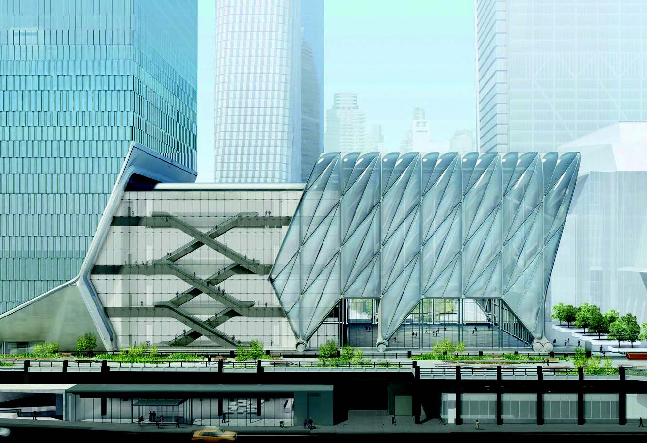
In the realm of criticism, however, metaphor is still a helpful tool. And if we extend the idea of this efficient and commercially successful “load factor” into the public space, we witness how privately funded spectacles can generate maximum returns for minimal investment. It’s the Shed and the Vessel—“architecture of infrastructure,” in Shed designer Elizabeth Diller’s words—that have received the near totality of public attention paid to the buildings of Hudson Yards, while the towers have been ignored almost completely. But what about the egg to the Shed’s chicken: the luxury residential tower at 15 Hudson Yards that DS+R are simultaneously developing? Or the Neiman Marcus store for which the Vessel serves as anchor? It’s easier to write about the Shed and the Vessel not only because of their marquee-name designers and their attempts at innovation, but also because they profess to have a more cultural, and therefore public, purpose than the surrounding office towers, retail “experiences,” and luxury housing. However, culture is more than Fashion Week and selfie-centered outdoor activity, and as so often happens in megaprojects, signature flourishes like the Shed and the Vessel perform as bait for the revenue-generating switch. If you’re looking for an actual architecture of infrastructure, Hudson Yards is full of it. The ideology of mixed use — deftly sublimated by Related and KPF from the extant, tangled city to this fresh, floating one — is surely visible if we can only get better at looking for it.
I’ve been trying to do just that in my most recent, more frequent visits to the west side. Heading north on the High Line, just as the path begins its sharp turn west at 29th Street, 10 Hudson Yards rises up over the throngs with a memorable, almost kinetic, welcome gesture. One might be tempted to say that the building “literally” opens up to passersby with a not-so-small section cleaving from the main mass, hoping to draw visitors towards the Yards. But this particular cleave is the headquarters for the mass-luxury brand Coach, so unless one is scheduled for a meeting inside (which I’ve yet to have), the follow-through on that gesture is fleeting at best. Completing the 90-degree turn, however, the so-called “spur” of the High Line does extend between and underneath the pylons of 10 Hudson Yards, and the crowds passing through are able to come into close contact with a material palette meant to reflect the industrious self-image of the site and its developers.
Unlike the Whitney Museum of American Art, which tried and failed to include an entrance from the southernmost end of the High Line, 10 Hudson Yards features a rare entrance plaza right onto the former railway. Directly across from the Shed, and within sight of the Vessel, this welcome to Hudson Yards is meant to impress. The mall, or “retail experience,” will soon open to visitors—perhaps as they wait for their timed-ticketed turn at the Vessel—at 20 Hudson Yards. Rising just beyond is 30 Hudson Yards, which will be the new home for the media company Time Warner, which is trading up from one mixed-use urban experiment to another.
The notable attributes of 30 Hudson Yards all speak to and with those of its dance partner—the only completed tower to date. In both, a post-industrial aesthetic below yields to a canted, reflective surface whose “shingled” readjustments, rippling from floor to floor, syncopate the building’s workaday rhythms. Breaks marking mechanical space—much of which had to be moved upstairs; regulations changed after Hurricane Sandy struck mid-design—serve, along with the glass shingles, as a welcome interruption to their otherwise commonplace façades. At the northern end of the elongated block, the main entrance for 30 Hudson Yards dramatically insets the entirety of the building’s northwest corner, at 33rd Street and the new Hudson Boulevard, drawing visitors’ bodies up inside, and their eyes up outside.
Along 10th Avenue, very much still a construction site at the time of this writing, the designers at KPF have worked to attend to what is so clearly the backside of the development. (The east side of the street is a mess too; Brookfield, another big New York real estate concern, is undertaking its own large development, Manhattan West, between Hudson Yards and the future Moynihan Station.) There they opened one monumental entrance for each of the towers, marked by a signature, transparent brow for Time Warner at 30, and another shear on the southeast corner of 10, which defers to the High Line’s spur jutting out alongside it one level up. Marianne Kwok put particular emphasis on these through-lines between the old avenue and the new Hudson Boulevard—entirely mediated by the buildings’ architecture, which was required to deal both with a significant change in grade and also the bulky new venting apparatuses for the now covered rail yards below. But unless Neiman Marcus is your destination, or you work at L’Oréal or CNN and are late for a meeting, there aren’t many paths through a mall that command enthusiasm.
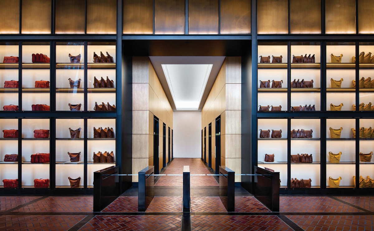
Then again, maybe you are going to Neiman’s. Maybe you do work at CNN. Maybe you’re a resident of one of the many luxury towers rising up around the neighborhood, or a guest at the new hotel branded by the luxury gym chain Equinox. And that’s just fine. But there ought to be a way to evaluate the project’s significance for the city beyond the Yelp reviews of its future residents or its rate of return to the public coffers.
Architecture, in its most practiced, large-scale forms, has lamentably become much more comfortable reproducing the image of mixed-use than considering its implications for specific times and specific places. Though Jane Jacobs’s programmatic diversity, managed density, and efficient productivity certainly have their upsides, we’ve all seen how the West Village has turned out. (First Marc Jacobs pushed out the old crowd; now even Marc Jacobs can’t make the rent.) And though Robert Moses brought much needed public housing, parkland, and infrastructure to the city, we’ve also seen the lasting violence wrought by his egomaniacal methods. New York is a product of this iterative lesson-learning, and the diversity, density, and productivity that has truly emerged as a result is nothing short of astounding.
But I worry, pressured by New York’s unjustified if omnipresent nostalgia, that the optimistic era of not just Moses but Jacobs too has passed us by. Establishment, anonymous architecture is today hard-pressed to generate much controversy in and of itself. Gentrification and housing crises of various stripes are reasonably the more urgent enemy today, leaving developer-architects’ genericism to take only secondary hits. To be clear: It’s not that we need new icons; we’re just in desperate need of new ideas. In America today, opponents of the social and economic dispensation that resulted in a real estate developer’s election as president no longer even try to propose a “New Deal,” as FDR did, or even a “Fair Deal,” in Harry Truman’s words. Instead, donations are sought in support of something simply “better” than the developer-president’s chaos. The Democratic leader Nancy Pelosi, a few months back, had a choice phrase for today’s opposition: “We’re capitalists, and that’s just the way it is.”
At Hudson Yards, the architects are doing their job well, and this uncritical practice is beginning to be made perfect. After all, increasing property values is the ultimate goal for which architecture is here called into service. KPF can’t be faulted for working within those constraints, at least as architects. But as New Yorkers? As always, I’m thankful to architecture when it’s able to reflect our city — good, bad, and ugly — back to us. But the question remains as to how much responsibility (and risk) architecture and its makers might take on, even if only as citizens, to design a reflection that more closely resembles the city — and culture — that we want, rather than the one we have.