White Raven
by John Ganz
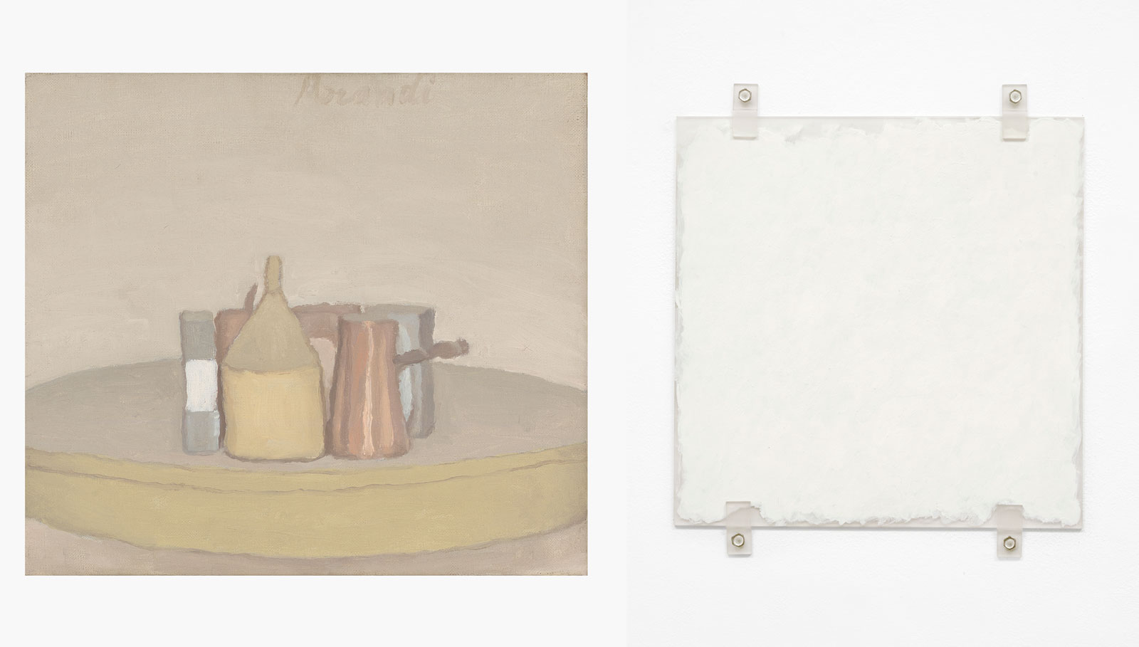
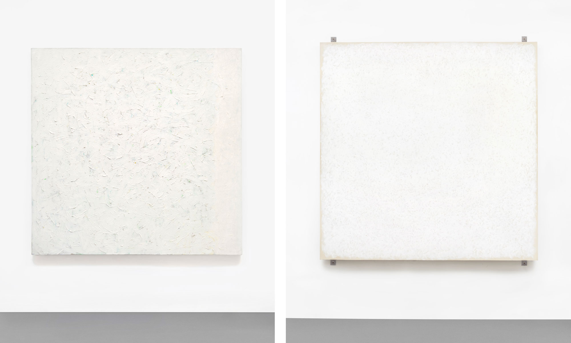
Left: Giorgio Morandi. Natura morta. 1948. Oil on canvas. 16 × 18 in. Courtesy ARS, New York, and David Zwirner, New York/London.
Right: Robert Ryman. Arrow. 1976. Oil on sanded Plexiglas panel, four sanded Plexiglas fasteners and hexagonal cadmium plated steel bolts. 13¾ × 12 in. Courtesy the artist; ARS, New York; and The Greenwich Collection. Photo: Bill Jacobson.
This essay appeared in Even no. 3, published in spring 2016.
When I first started to get interested in painting, the names Robert Ryman and Giorgio Morandi came up a lot in the same conversations. They were inevitable touchstones when talk turned to depth and commitment. Both were invoked as examples of a monkish devotion, which was taken to be the height of painterly virtue. Their palette is in the same muted, buff-white-tan ballpark, and they both handle paint with tentative elegance. They are both consistent — not to say repetitive — in their aesthetic concerns, and they work with an extreme economy of means. Though they are often associated with contemporary movements, they are in fact idiosyncratic loners. Next to the alcoholic, obscene, and aggressive personalities that dominated much of 20th-century art making, they are models of shy-guy seriousness. And the reverence they inspire among painters can be met with total incomprehension. I personally got so used to Morandi being thought of as unimpeachable that I was surprised when my dad came back from a Morandi show mildly bad-tempered. Promised one of the great painters of the last hundred years, he was underwhelmed by the endless succession of muted still lifes. In his memorable phrase: “It’s just the same damn thing over and over.”
Morandi’s career had almost ended when Ryman was just getting started, and it’s tempting to think of Morandi and Ryman as embodying the two halves of the 20th century. In Morandi you have a European, academically trained in a figurative tradition that goes back to Giotto; Ryman is an American, self-taught, a close observer of the modern masters, and resolutely abstract from the get-go. Both relate to the tradition of painting in a way that’s neither slavish nor petulant, which might be one of the necessary conditions of being an important painter, but more on that later.
Many fans see in both painters two relatively straightforward specimens of exquisite taste — no doubt because, as Goethe had it, “people of refinement have a disinclination to colors...owing partly to weakness of sight, partly to the uncertainty of taste, which readily takes refuge in absolute negation.” (1) Their supposed closeness can even prompt some to leave the realm of the senses entirely and posit a metaphysical bond between the two. When Ryman and Morandi were recently paired in a show at Kohn Gallery in Los Angeles, one reviewer called it an “inevitable, predestined union” before going on to pant, “We might be looking at Plato’s searching lovers, who only learn they are not whole when they discover their other halves.” (2) I didn’t see the show, but I suspect that analogizing the duo to the cloven paramours of the Symposium might be a bit of an overstatement. (I’m also tempted to add that given what little I know of Plato’s searching lovers, they seem unlikely to run into each other in Los Angeles.)
As it happens, I’ve got some inside dope on Ryman’s feelings towards his putative other half. I was once told by someone who knows Ryman that he demurred when invited to see the Met’s 2008 Morandi exhibition, claiming that Morandi’s paintings made him “anxious.” We might be tempted to read this as the anxiety of influence, but I don’t think the famously unassuming Ryman meant that. Maybe Morandi just doesn’t do it for him. Comparing their recent exhibitions, it’s easy to imagine why, so different are the sensibility and spirit of their respective endeavors.
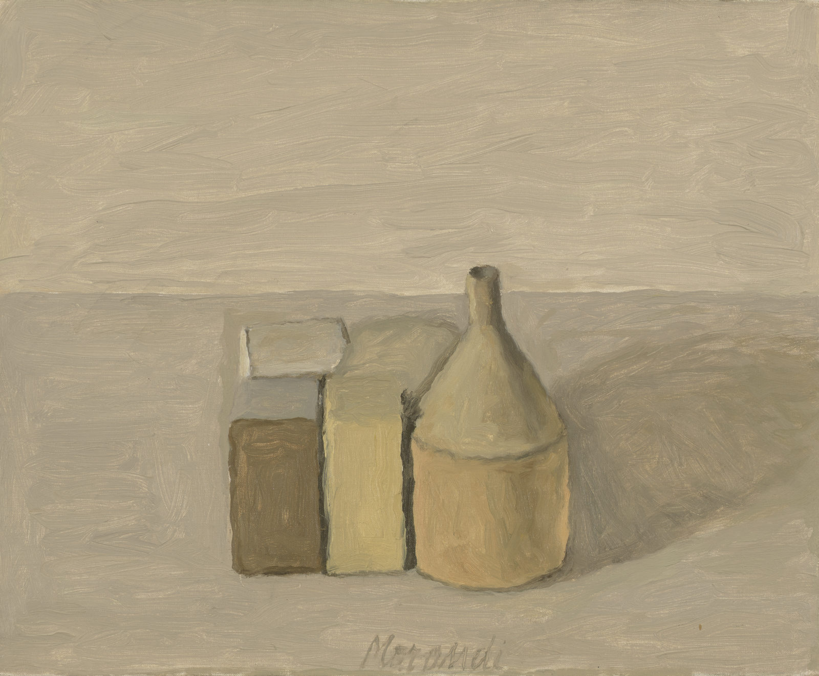
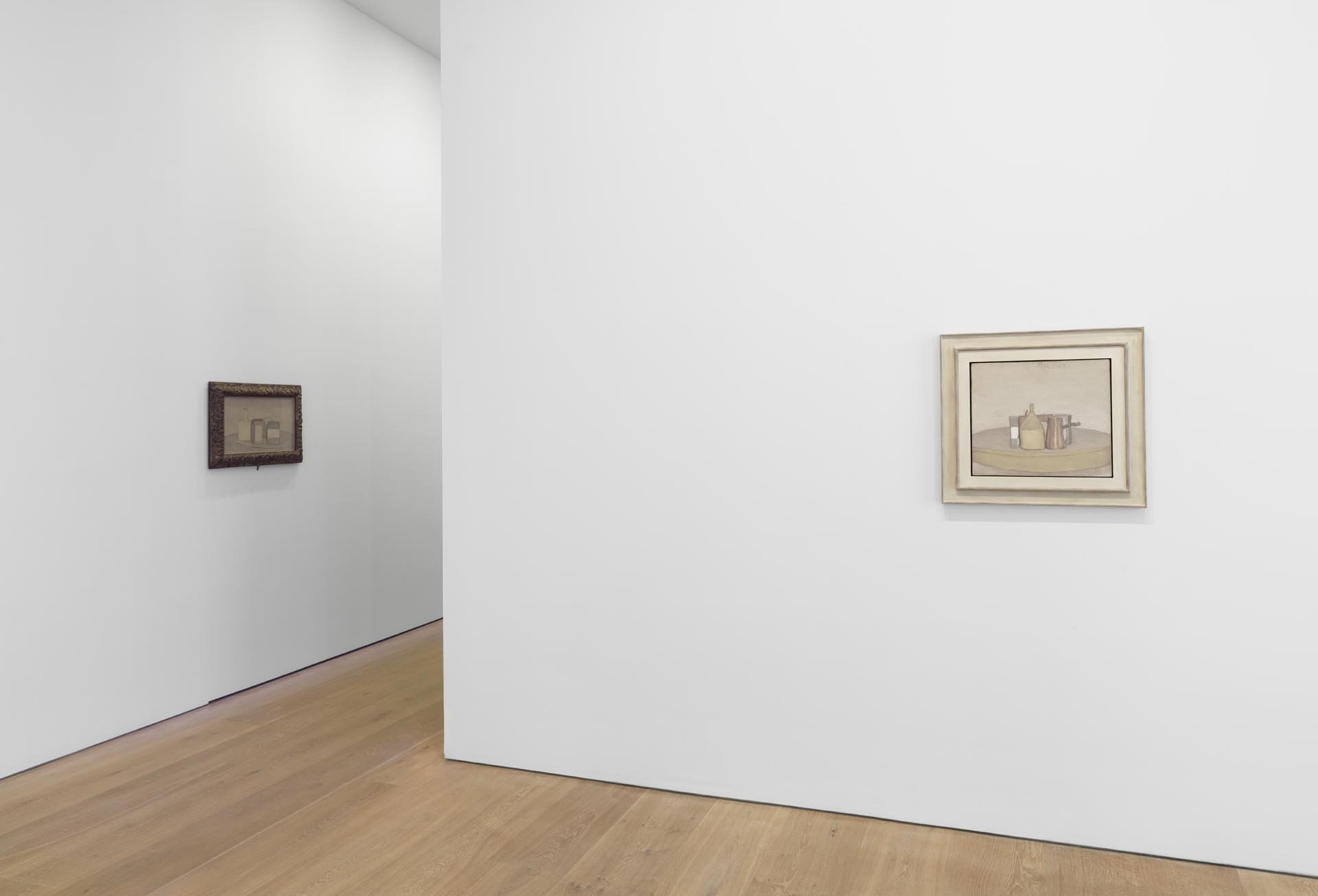
I’ve always had an automatic, almost knee-jerk, appreciation for Morandi, but a recent exhibition of his paintings at David Zwirner left me uneasy. I thought I was one of the people who saw in Morandi quiet heroism and resolution. This time around, the still lifes gave me the impression of a cramped and dreary life that is difficult to romanticize. It’s not hard to see pathos in the bowls, bottles, and jars that repeatedly, but quietly, populate each painting. His palette runs toward the “seasick” color range, and the objects in a Morandi, more often than not, come to resemble nothing more than a family cooped up in an apartment while fascism and war come and go. If you pulled someone off the street, showed them this suite of Morandi’s work, and said, “This guy lived with his mother and didn’t get out of the studio much,” they’d probably respond, “No kidding.”
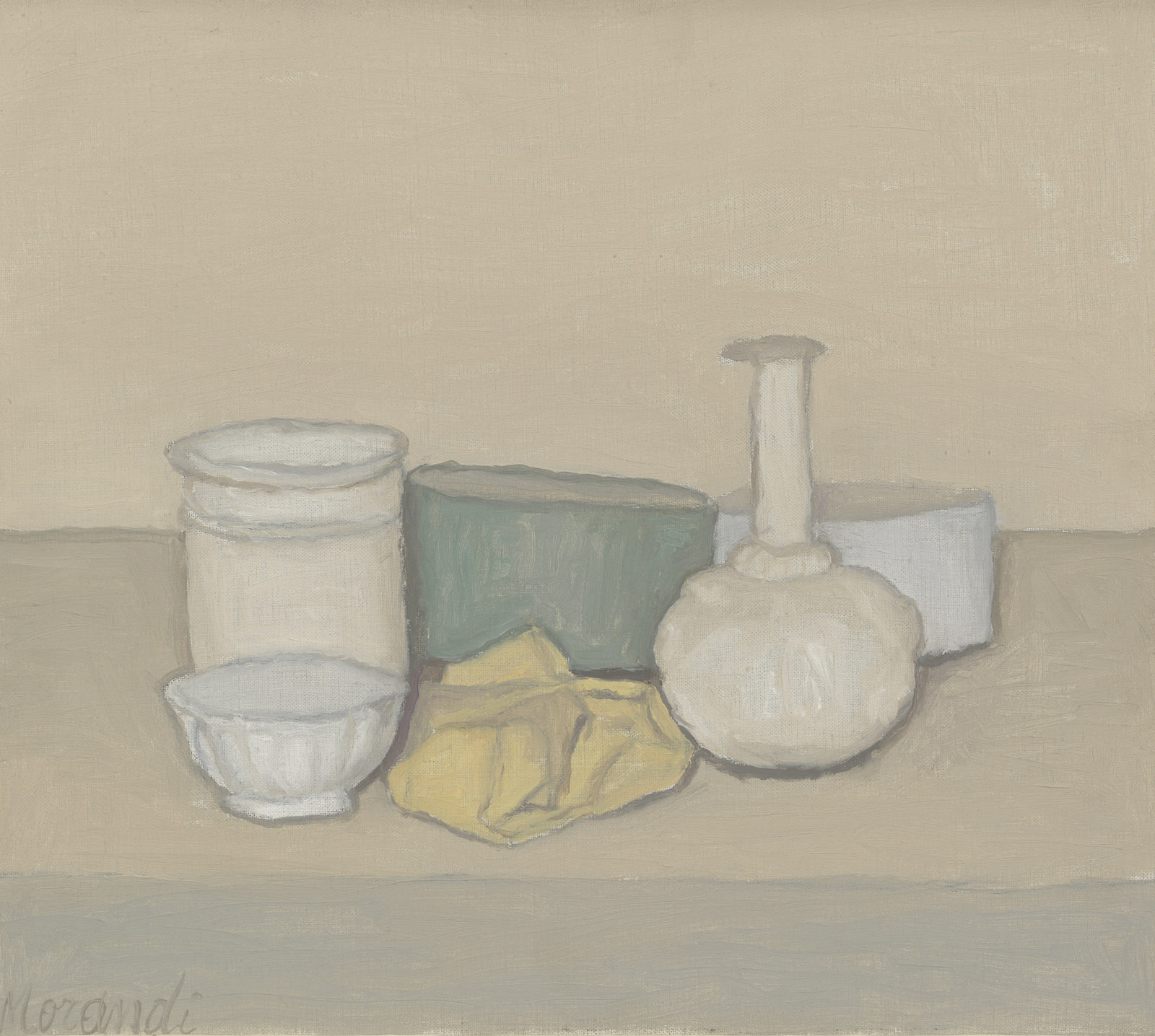
I’m usually touched by the sight of octogenarians with walkers shuffling up to small paintings, but at this show it seemed to reinforce the dour atmosphere. I wanted to move along quickly, and had to force myself to focus. Admitting that Morandi strained my patience could be the prompt for a lengthy meditation on the nature of perception, but I’ll spare you that sententious old spiel about paying attention in this, our age of distraction. That said, Morandi’s still lifes aren’t very still. Look long enough and they have a kind of movement: the forms jostle for position between foreground and background, the lines undulate with tentative little brush strokes, worming their way through the compositions. All of these paintings might be called Natura morta — still life, in Italian, but literally “dead nature” — but there seems to be something alive in there. Alive, though maybe not well.
Friedrich Schiller once drew a jagged line and a curving line in a letter to a friend. Only the curving line, Schiller held, can be truly beautiful, because its movement shows freedom and life, not a mechanical rigidity. (3) In 1793, it may have made sense to ascribe clear virtues to form; by the early 20th century, such straightforward claims no longer convinced. The appearance of movement no longer signaled life, and the flowing curve was replaced by the anxious squiggle. The subtle vibrato of the visible world didn’t mean freedom to Morandi. “I believe there is nothing more abstract,” he said towards the end of his life, “more surreal than reality.” He may have sought tranquility, but ended up finding a very lonely version of it, the type one might find on an alien planet that has its own unctuous, viscous, slithering energy.
Ryman, Morandi’s supposed other half, has an entirely different feel. At the Dia Art Foundation — back in Chelsea after almost a decade — the curator Courtney J. Martin has put together a summary of Ryman’s entire career in a very pithy 22 pieces, hung in a small anteroom and a large undivided gallery. It’s installed with all the sensitivity to light and space that his work demands. If you saw only this Ryman show, you would get a pretty adequate idea of what he’s all about.
Though it’s not clear what Ryman is all about, which is one of the reasons to recommend his work. To put it mildly, Ryman is formally reserved, a quality that puts the onus on the viewer to attend to his work carefully. Early on, Ryman decided to restrict himself largely to white paint, but in a way that remains in service to a subtle attention to color and texture. Early on there are still hints of other pigments. Until the mid-1960s, blues, reds, and greens sometimes peek out from behind thickly applied whites. Ryman’s brush, when he allows it to appear, is deliberate and careful, without seeming fussy or precious. His stroke borrows something of the energy of abstract expressionism, but declines to call attention to its dash or aplomb. Instead, the texture and personality of the brushwork always serve to activate or set off another part of the painting. Ryman realized that the contrast between the paint and the painting’s support (canvas, linen, aluminum) could be his palette, a move he later compounded by contrasting the painting with the gallery wall. Viewed at a distance, any group of Rymans doesn’t camouflage itself within the white cube, but jumps out. Every move Ryman makes can be characterized as a sensitive response to the whole: to the whole painting, to the whole gallery, and to the whole of painting before him.
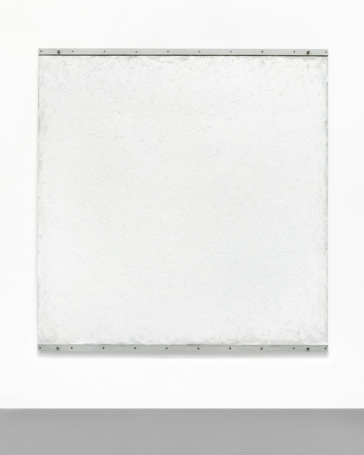
Right: Robert Ryman. Counsel. 1982. Oil and Enamelac on stretched sized linen canvas with four steel fasteners and four square bolts. 102 × 96 in.
Both courtesy the artist; ARS, New York; and The Greenwich Collection. Photo: Bill Jacobson.
Robert Ryman came to New York from Tennessee in 1952 with the intention of becoming a jazz saxophonist. He bought a set of paints at an art supply store and began to experiment in 1953, the same year he got a day job as a guard at MoMA. The experience of the museum and of jazz are both essential to understanding Ryman. Both contain a basic structure that becomes subject to improvisation and variation. Both carry a certain notion of tradition as something to be understood, responded to, and revised. Ryman is not radical or reactionary, but rather thrives when improvising from the givens of art: the wall, the support, or the medium. As he once said: “I was not interested in free jazz, I was interested in jazz with a structure.”
“I felt that anything in a museum was worthy of being there,” Ryman also said. “So I looked at everything and got something from everything.” Looking at the metal brackets on Post (1981), or the staples and chalk lines on Arista (1968), one can imagine how Ryman the security guard absorbed the interstices of the museum while glimpsing installations in progress, how he saw the cleats on the wall, the staples on the sides of canvases. He brings the “background music” (the subtitle of one of the paintings in the show) into the foreground, much like how in bebop the drums no longer simply provide a beat but become a central part of the whole ensemble.
Ryman cites Willem de Kooning, and it’s not hard to see why. De Kooning’s paintings of the 40s and 50s paid subtle attention to the geology of the city: decaying signage, peeling paint, graffiti, cracks in the sidewalk. In a more low-key and less anguished way, Ryman was attuned to similar things. This is most evident in the earliest works on view in the Dia show, including the paintings on paper To Gertrud Mellon (1958) and Untitled (1958). Dark forms come from the edges to interrupt fields of slathered-on white casein, a fast-drying, milk-based pigment than can be thinned like gouache or as thick as glue. There are hints here and there of graphite pencil marks. They fall somewhere in between totally incidental and carefully deliberate. It’s hard to tell if the signature “RRYMAN58” in To Gertrud Mellon is naive or almost a little wisecrack, saying something like: “You see, I signed it — so now it’s a painting.” If you take the subway, you can see a lot of these types of Rymans: think of how a ripped subway map reveals the white background and dabs of black Rust-Oleum. What Paul Valéry said of the French realists can be applied to what Ryman takes from his abstract-expressionist forebears: “Their positive merit, it seems to me, was to have found... poetry, and sometimes the highest poetry, in things or themes which until then had been considered base or insignificant.” (4)
There are two schools of thought on Ryman, the “intellectualist” and the “empiricist.” (5) The first holds that Ryman’s body of work forms an art historical comment, an exercise in modernist “end game” aesthetics, that he’s rehearsing either the death of the painting, or its rebirth, or both at the same time. “Intellectualists” believe that he is asking what a painting really is. I am not alone in thinking that this interpretation attempts to jam Ryman into a rigidly periodized canon of art-historical modernism, a process that often requires projecting absurdly fine epicycles into his work so it can keep its orbit.
The “empiricist” school’s main (and possibly only) member is Rob Storr. His writing has the virtue of throwing cold water on the silliness of his opponents, but it goes too far in the other direction. He sternly cautions that “it is with simple description that one must begin any serious critical assessment of Ryman’s achievement.” For Storr, who compares Ryman to Matisse, his work should be seen as an affair of delicate pleasure seeking. This is very close to saying: look, but don’t think. It’s far from clear that this is either possible or desirable. We risk losing any sense of history or situation or context, as if we’re supposed to think of Ryman — as Cézanne famously said of Monet — as “just an eye, but what an eye.”
But in Ryman, I see neither mere conceptualism nor empiricism, and none of Morandi’s unhealthy asceticism either. Painting, when it’s at its best, doesn’t really deal in the abstract distinction between concept and perception; it shows concrete sensibility, which always unites thought and feeling. Ryman’s sensibility is a refined lyricism of urban life — a life we still broadly caricature as hurried, inattentive, and corrupt in public, or mannered, vain, and false in intimate settings. Either we credit the city with alienation and grit, or else we engage in grandiose Gershwin-blaring, skyline-baring sentimentality. Ryman, by contrast, draws our attention to the white noise of the city, and articulates what’s usually ignored or forgotten in the background. After Ryman, the things we usually glance at and pass over quickly can return to us renewed. I saw the show with a sophisticated Manhattanite artist, who spent a few minutes looking around before saying, “Maybe I don’t get art at all.” I think that’s a healthy experience to have from time to time.
(1) Johann Wolfgang von Goethe. Theory of Colors. Trans. Charles Lock Eastlake. Dover Publications. 2012. p. 180.
(2) Grant Johnson. “Giorgio Morandi and Robert Ryman.” Artforum.com. October 2015.
(3) Friedrich Schiller. “Kallias, or Concerning Beauty: Letters to Gottfried Körner.” 1793. Reproduced in Classic and Romantic German Aesthetics. J. M. Bernstein, ed. Cambridge University Press. 2002.
(4) Paul Valéry. Degas, Manet, Morisot. Trans. David Paul. Princeton University Press. 1971. p. 109.
(5) Susan P. Hudson’s very interesting (but also very difficult) Robert Ryman: Used Paint tries to present Ryman as a pragmatist to undo this antinomy.